CoffeeCup Responsive Layout Maker Pro Screenshot
Responsive Layout Maker is the ONLY app that addresses the most fundamental aspect of responsive web design: creating a custom responsive layout that optimally supports and present the content at every possible device width. Don't let code kill your responsive creativity - use layout maker for responsive prototyping and wireframing.
1) Multiple Configurable Grid Systems:
Layout Maker comes with a growing number of integrated grid systems, including the Bootstrap grid. Column counts and gutter widths can be customized for each system.
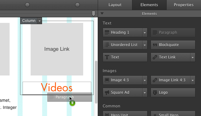
2) Drag-n-Drop Content Blocks
Design from the content out and tailor layouts around unique content and business needs. Add anything from a paragraph to an input element with just a drop.
3) Custom Layout Designs
Add rows and content containers with a simple click. Toggle column spans, stretch rows, or constrain their widths. You can even use subgrids and container nesting for ultimate layout control - kabam!
4) Configurable Element Properties
Control paddings, margins, floats, font styles, links and everything else that is needed to create a layout in which your unique content looks its best no matter what.
5) Custom, Content-Driven Breakpoints
Use the built-in viewport slider to view the design at every possible width. Add breakpoints to change column widths, define responsive actions, or tweak margins and sizes to guarantee that the layout optimally usable on any device.
6) Browser-Based Prototyping
Wireframing and previewing in an actual browser, makes the designs interactive and resizable. No more huge pile of static images to illustrate what a design might look like on different devices. Sweet!
7) Clean CSS - Semantic HTML
No superfluous machine generated styles, layout maker keeps everything crisp and clean for easy hand tweaking. You can even us
Back to CoffeeCup Responsive Layout Maker Pro Details page
- Picture Collage Maker Pro Layout
- CoffeeCup StyleSheet Maker
- Coffeecup Shopping Cart Pro
- Coffeecup Shopping Cart Creator Pro
- Responsive Readings
- Responsive Byte Logger
- Responsive Time Logger
- Responsive Virtual Drums Online
- Layout Maker
- Se Layout Maker